
Website, UX Strategy
University of Illinois Gies Online

Process
Research & Discovery → UX & Content Strategy → Visual Design ↔ Prototyping & User Testing → Development and QA
Team
One of two designers working with UX strategists, project manager, and developer
Techniques
Design discovery, visual designs, prototyping, setting up user testing, evaluation of user test results, Figma dev file handoff, collaboration with client team developer
About
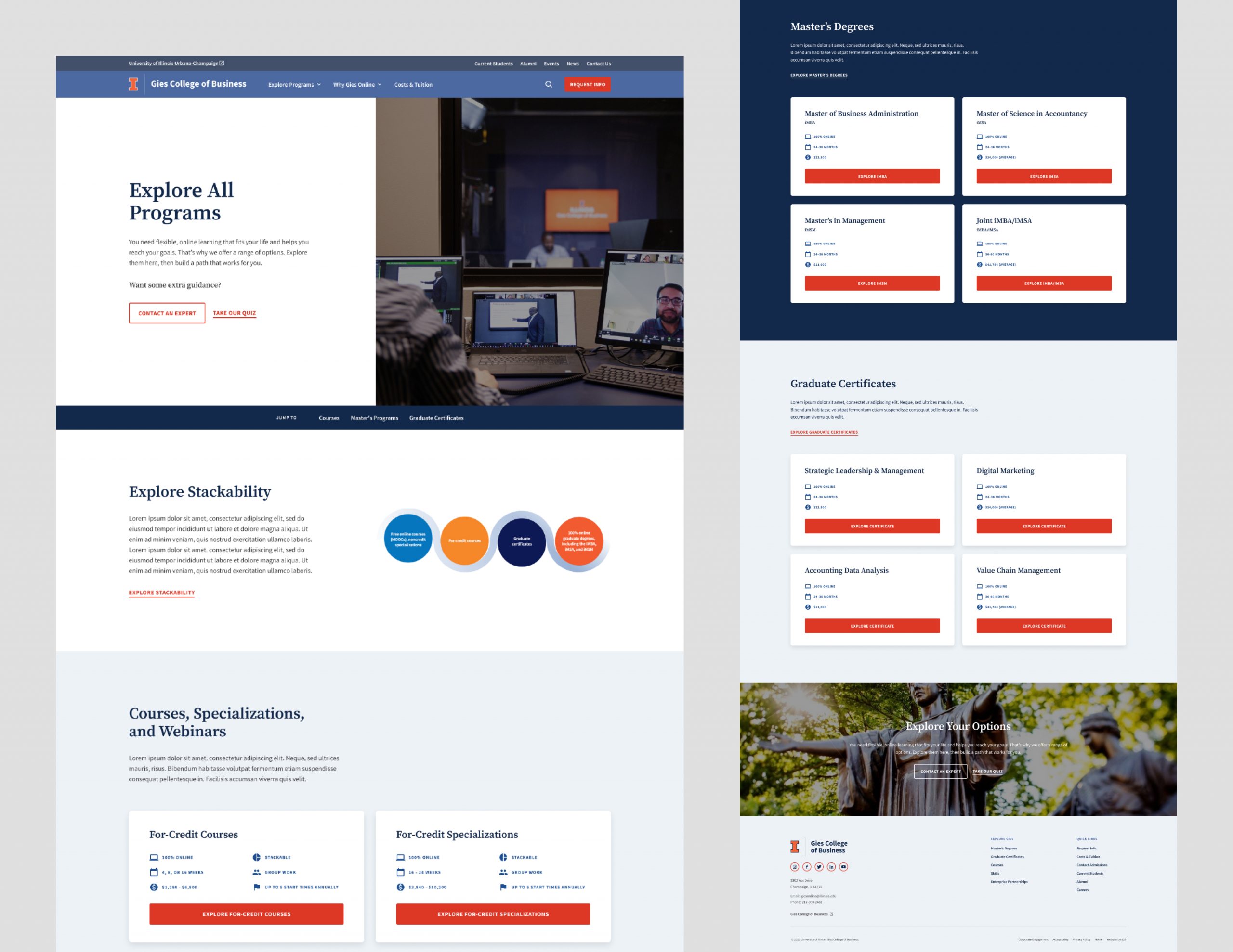
The Gies Online team was seeking a consolidated and streamlined website. As a part of the University of Illinois Giese College of Business, the department already had an established brand and web presence. For this project, their goal was to build a hub that housed all Gies Online offerings in one location, instead of distributed on various platforms. This new hub would act as the catalog for all online programming. If successful, the site would do the following things:
- Increase annual enrollment of qualified applicants.
- Simplify the user experience for all students.
- Better showcase the Gies Online brand.
Research & Discovery
After meeting the Gies Online team, we sent out Kickoff Questionnaires, an Audience Survey, and a Stakeholder Survey. We analyzed their Google Analytics Report and summarized our findings in a presentation deck.
A great resource we tapped into was the recent audience survey findings conducted by the University. We were able to see data for the current site. Seeing that participants using mobile generally had a more difficult time than those on desktop, the Gies Online team was keen to build a successful mobile experience for their new site.
Reoccurring feedback included users:
- Being overwhelmed by the many different learning tracks and needing an option to compare and explore all offerings in one place.
- Not understanding the “stackable” concept of how courses can build on each other.
- Not immediately understanding the connection between Gies Online & University of Illinois.
- Not easily finding information on cost, duration, and learning expectations.
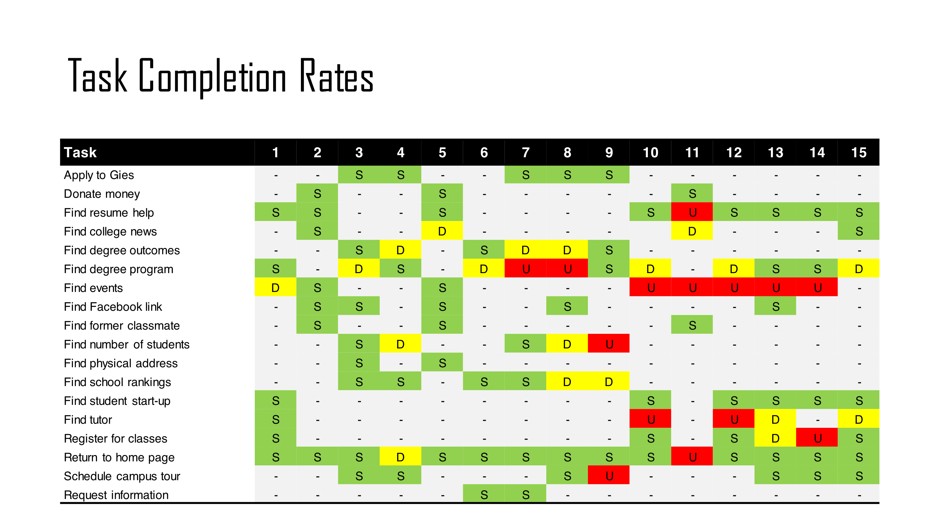
Other summaries of results can be found here in the Creative Brief, including target audience, personas, and brand strategy. Below is a screenshot of prior research of tasks completed or failed by users. These findings show that users have a hard time finding degree programs and events.
Strategy
After the research phase, we took our findings to build out our strategy. Our findings from the surveys were helpful in creating the new Gies Online sitemap. We were able to show the client all the calls to actions and pages that would help them achieve their goals.
You can see the full sitemap here.
Information Architecture
After the sitemap was approved, we built information architecture for each page.
See the full IA document here.
Wireframe Flows
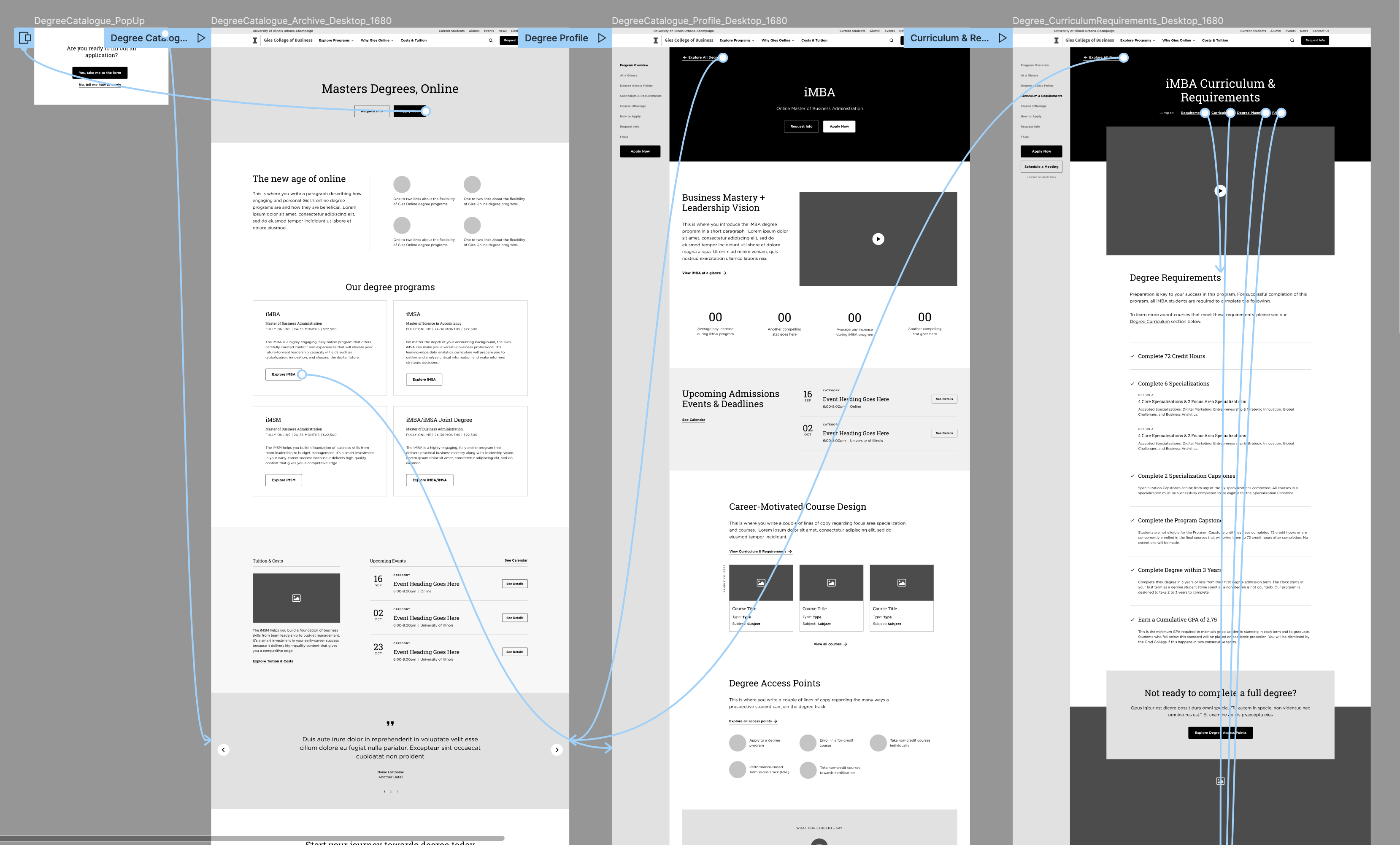
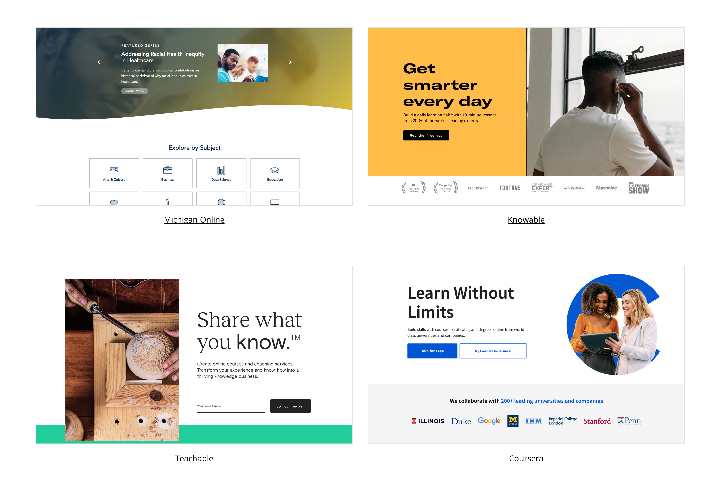
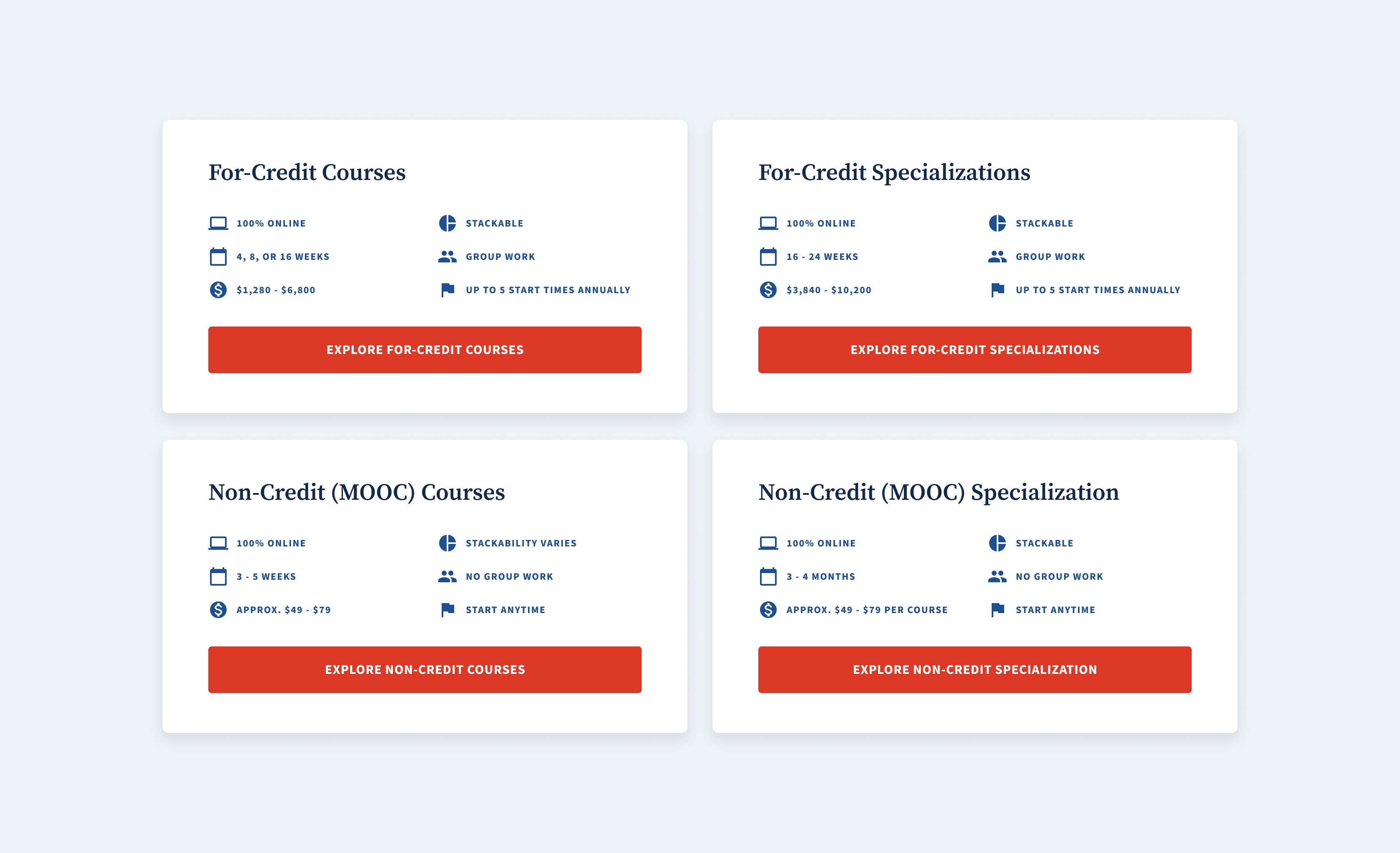
Using information from the sitemap and the IA we built, we designed wireframes that were presented to the client. The structure was inspired by other successful online course catalogs such as Coursera and UMich Online. We could utilize these card styles and the flow of information but retain a University feel. We could let the user access more detailed levels of information as they needed, with the option to apply at every level. Below is an example of that thought pattern for Degrees.
See Degree wireframes here
Design
Design Discovery Board
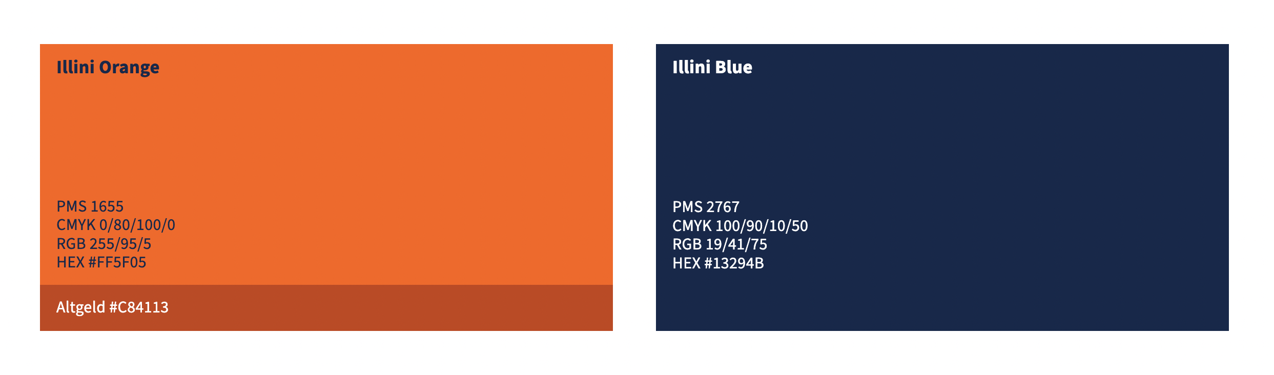
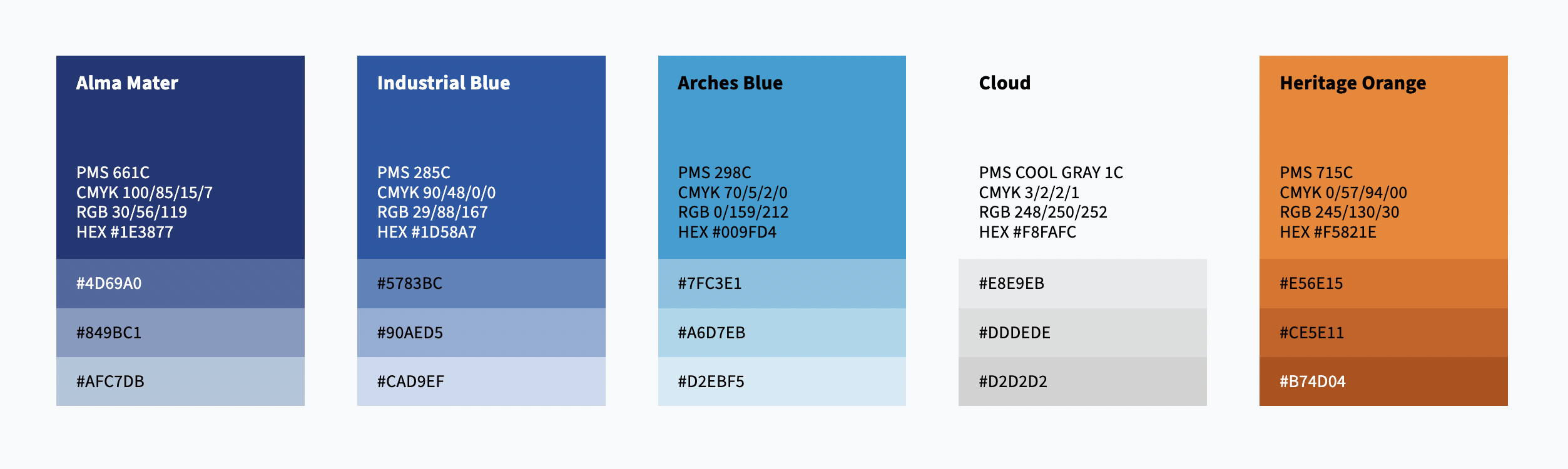
Even though the client already had a design system we thought it’d be important to hold a conversation about how they saw that brand coming to life. Typefaces, colors, and imagery were already provided. the discovery session was focused more on the style of UI. Did they want a layered approach or flat? How much white space? What did they mean by approachable or academic?
After our discovery conversation, we pinpointed that the client wanted something clean and up-to-date with large imagery.
You can see the full board we presented here
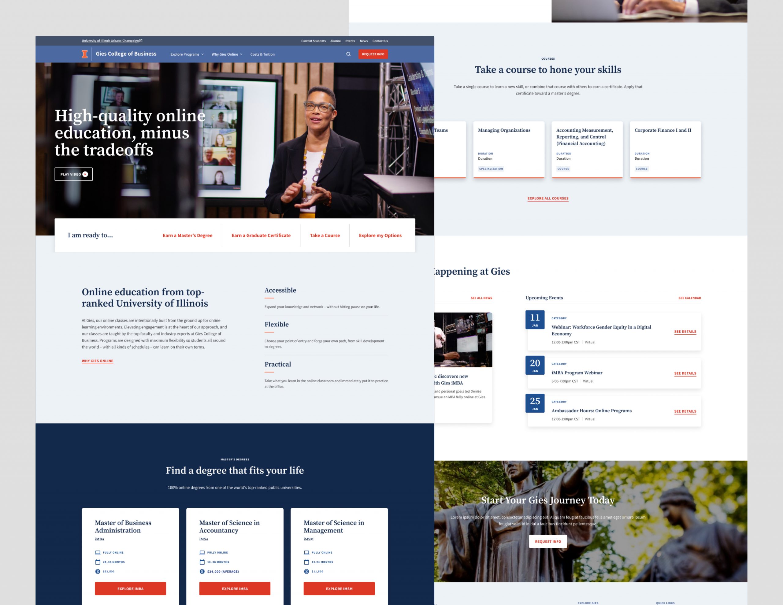
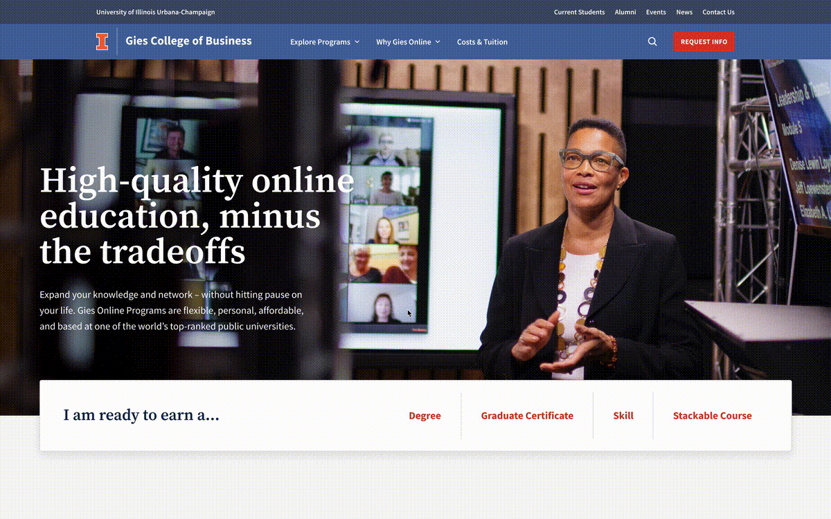
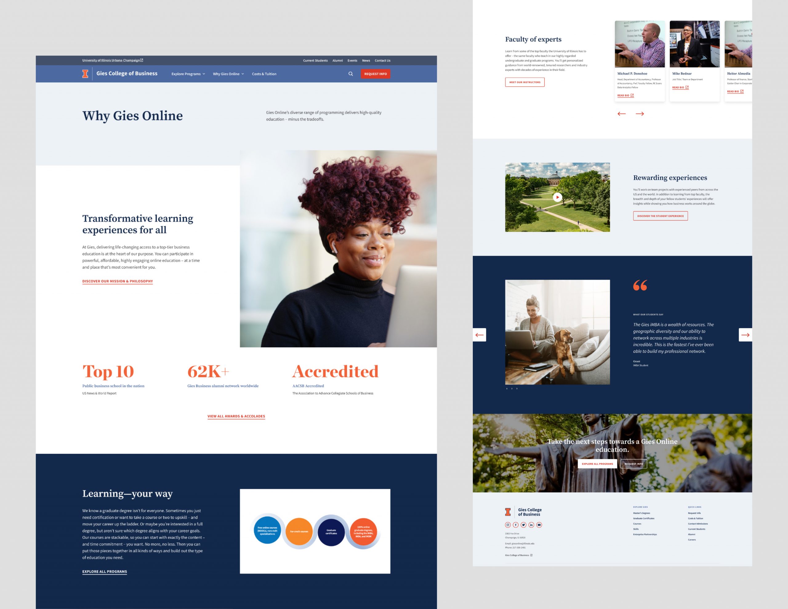
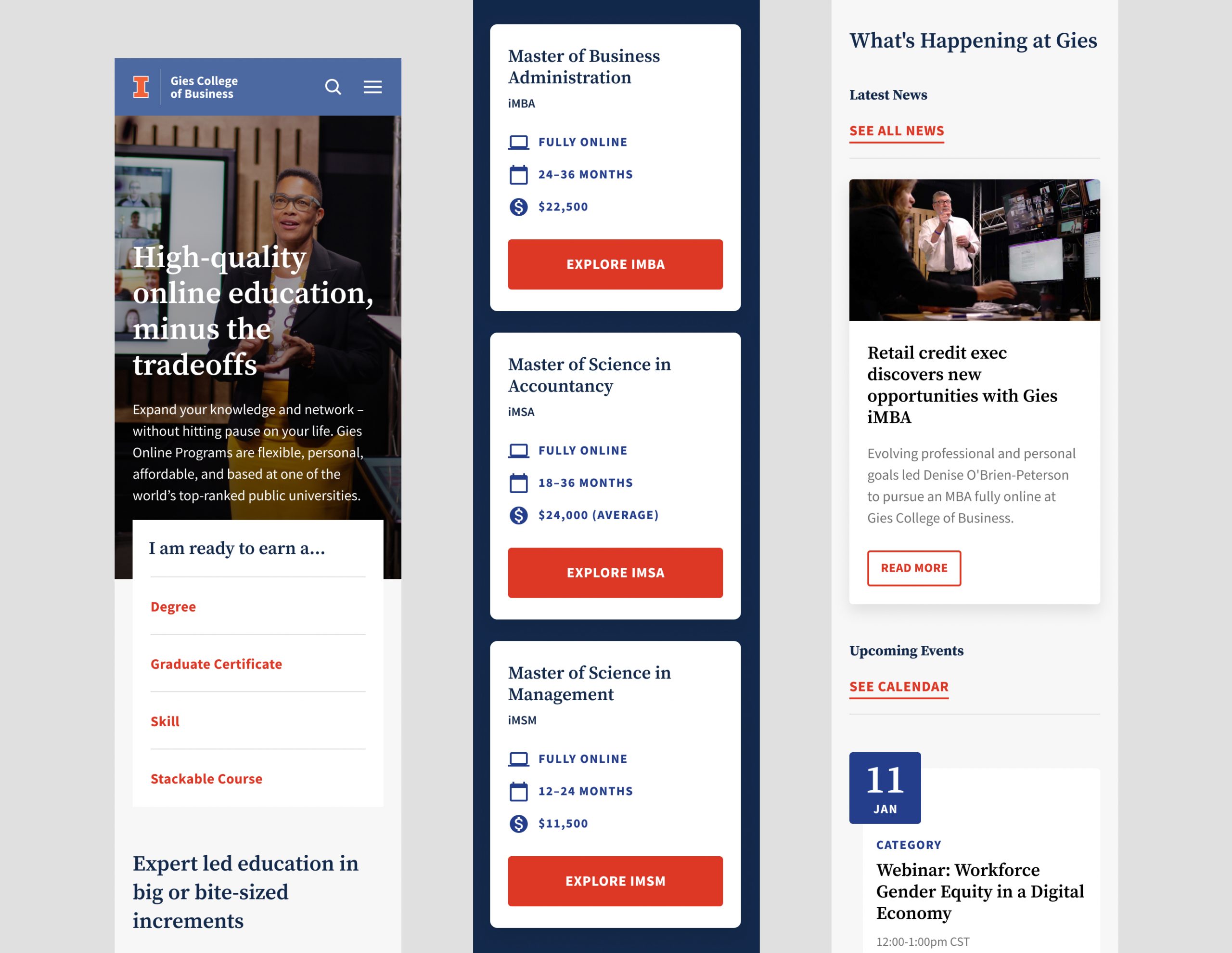
Visual Design
The site would also clearly communicate that Gies College of Business was part of the University of Illinois by using the same design system and header and introducing itself as the University of Illinois in the copy front and center.
User Testing
Our team was asked to test out our designs to see the validity of what we proposed. We included three rounds of user testing and partnered with Gies' user testing agency, Straight Line Theory, to carry out the tests. 829 Studios was responsible for creating prototypes of these rounds of tests, debugging prototypes, and analyzing results to suggest and execute appropriate changes to design and strategy.
You can see an example of a prototype here the full presentation deck of results here
Test Result Updates
Overall, the designs were successful. One important result from user testing was that an Explore All page would benefit its users. This way users would be able to get a glimpse of all of the offerings at Gies before diving into more information. This was one trade-off we made by client request, but the 829 team was happy to add this page back in as we saw the user need.
Takeaways
The new website is undergoing development by the Gies team. We are excited to see the site live and its conversion metrics. In the end, it consolidated everything Gies Online offered clearly. Below is a summary of our solutions:
- Being overwhelmed by the many different learning tracks and needing an option to compare and explore all offerings in one place.
All offerings are housed on the Explore All page for users to view at once. Degree cards are designed so that users can easily scan the differences between degrees. - Not understanding the “stackable” concept of how courses can build on each other.
We dedicated a page to course stackability to explain and demonstrate how a prospective could utilize this unique offering. - Not immediately understanding the connection between Gies Online & University of Illinois.
We tackled this by introducing Gies as UIL in the first paragraph of the homepage, using the same colors and fonts, including their logo in the footer, and the same header as the main University.
What would have provided for a more effective user test is if we were able to provide all of the pages of the site at once. The results were skewed, though still helpful to the design and strategy process, especially to adding back the Explore All page.
What also was learned was accountability in setting boundaries with revisions with clients. We established a three-round revision model tracker. This would help the internal 829 teams stay within the scope of the project and within the timeline.
This project was done in partnership with 829 designer Courtney Lord.